Models updated as of April 19, 2024

Reminder: These models are not trading advice. The best investment strategies are long-term diversified holdings, not frequent trading or market timing. Please see the About page for additional information and disclosures.
Feedback: feedback@currentmarketvaluation.com

All comments are appreciated. We read every email, but can't always respond.

Aggregate Market Value Index
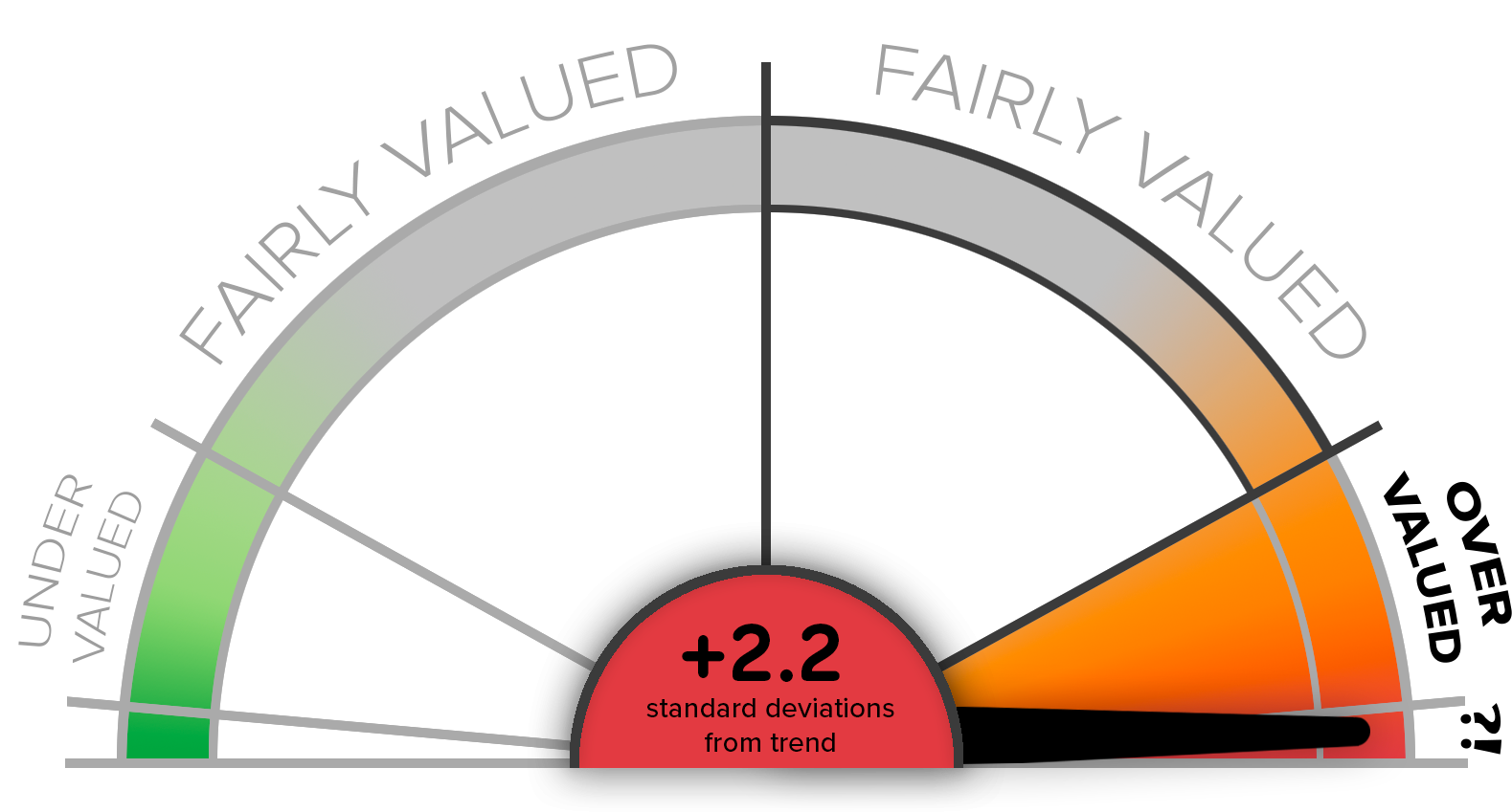

CMV Aggregate Index Score - Speedometer Chart
Currently Overvalued

Updated April 19, 2024. The Aggregate Market Value Index model (AMVI) is a composite index of several of our market valuation models, providing a high-level view of current US stock market prices relative to historical valuation trends. This provides an idea of how overbought or oversold the market may be. The model is updated at least weekly.

While the intention is to present a view of overall market valuation, and therefore a signal as to market upside or downside, this is not a short term trading model. Markets can stay extremely under or over valued for long periods of time. Trying to time the market, even using long term business cycles such as this, has historically underperformed a buy-and-hold investment strategy.

Performance Return Horizons

AMVI Model Correlation w/S&P 1-Month Returns

  • Scatterplot shows no clear pattern.
  • On a scale of 0 to 1.00, the R-squared regression value is 0.01.
  • Conclusion: There is absolutely no correlation at all between AMVI model score and subsequent 1-month S&P500 returns. This model has zero information about stock market returns 1 month out.

AMVI Model Correlation w/S&P 3-Month Returns

  • Scatterplot shows no clear pattern.
  • On a scale of 0 to 1.00, the R-squared regression value is 0.02.
  • Conclusion: There is absolutely no correlation at all between AMVI model score and subsequent 3-month S&P500 returns. This model has zero information about stock market returns 3 months out.

AMVI Model Correlation w/S&P 1-Year Returns

  • The scatterplot shows a very slight diagonal band of points, suggesting a trend is developing.
  • There remain many data points in all four quadrants of the scatterplot.
  • On a scale of 0 to 1.00, the R-squared regression value is 0.10.
  • Conclusion: There is very little correlation between the AMVI model score and subsequent 1-year S&P500 returns.

AMVI Model Correlation w/S&P 3-Year Returns

  • A slight trend is visible in the scatterplot.
  • There are very few points in the lower left quadrant, showing it is quite rare for the model value to be below historic trend (less than 0), and for subsequent 3-year returns to be negative. Whereas negative returns are very frequent when model score is > 0.
  • On a scale of 0 to 1.00, the R-squared regression value is 0.23. This is still quite small.
  • Conclusion: There is some correlation between the AMVI model score and subsequent 3-year S&P500 returns.

AMVI Model Correlation w/S&P 5-Year Returns

  • A clear trend is visible in the scatterplot.
  • Almost all negative returns (left half of scatterplot) are from periods where model was at least slightly overvalued (model scores > 0).
  • Even so, important to note that periods of lowest and highest 5-year returns came after relatively neutral model scores.
  • On a scale of 0 to 1.00, the R-squared regression value is 0.39.
  • Conclusion: There is moderate correlation between the AMVI model score and subsequent 5-year S&P500 returns.

AMVI Model Correlation w/S&P 10-Year Returns

  • A clear trend is visible in the scatterplot.
  • Every single instance of negative 10-year returns (left side of scatterplot) occurred when AMVI model was well above zero, and in almost every case > 1, showing Overvalued or Strongly Overvalued model scores.
  • Likewise, every single instance of model undervaluation (> 1 standard dev below trend) was followed by very strong subsequent 10-year returns.
  • Note, however, that the strongest instances of 10-year returns (rightmost points on scatterplot) came after model was only very slightly undervalued.
  • On a scale of 0 to 1.00, the R-squared regression value is 0.58.
  • Conclusion: There is moderately strong correlation between the AMVI model score and subsequent 10-year S&P500 returns.

Model Summaries

A quick visual update on each of our tracked models is below. The colored gauge represents a normal distribution curve - E.g., a model should be within +/- 1 standard deviation of its historical trend (considered to be Fairly Valued), about 66% of the time, reflected as the central gray area. Our Ratings Guide has more information.

Click on any model row below to greatly expand available info.

Valuation Models Updated Rating Score
Buffett Indicator Apr 19 Overvalued 1.74

Chart shows Buffett Indicator ratio as # of standard deviations above/below its historic average.

The Buffett Indicator is the ratio of the total value of the US stock market versus the most current measure of total GDP. When this value is very high it suggests the stock market is overpriced relative to actual economic productivity. For more detail, charts, and sources, visit the Buffett Indicator Model page.

Chart shows the US Buffett Indicator value alongside its exponential trend line, dotted.

The Buffett Indicator is the ratio of the total value of the US stock market versus the most current measure of total GDP. When this value is very high it suggests the stock market is overpriced relative to actual economic productivity. For more detail, charts, and sources, visit the Buffett Indicator Model page.

Current US Stock Market Value $53.25 (T)
Current Forecasted GDP $28.16 (T)
Current Buffett Indicator (BI) Ratio 189.1%
Historical Trend BI Ratio 123.1%
Current Position Relative to Trend (%) 54% above trend
Current Position Relative to Trend (SDs) 1.74 standard devs above trend
Rating Overvalued

Performance Return Horizons

Buffett Indicator Model Correlation w/S&P 1-Month Returns

  • Scatterplot shows no clear pattern.
  • On a scale of 0 to 1.00, the R-squared regression value is 0.00.
  • Conclusion: There is absolutely no correlation at all between Buffett Indicator model score and subsequent 1-month S&P500 returns. This model has zero information about stock market returns 1 month out.

Buffett Indicator Model Correlation w/S&P 3-Month Returns

  • Scatterplot shows no clear pattern.
  • On a scale of 0 to 1.00, the R-squared regression value is 0.01.
  • Conclusion: There is absolutely no correlation at all between Buffett Indicator model score and subsequent 3-month S&P500 returns. This model has zero information about stock market returns 3 months out.

Buffett Indicator Model Correlation w/S&P 1-Year Returns

  • The scatterplot shows a very slight diagonal band of points, suggesting a trend might be developing.
  • There remain many data points in all four quadrants of the scatterplot.
  • On a scale of 0 to 1.00, the R-squared regression value is 0.06. This is still extremely low.
  • Conclusion: There is very little correlation between the Buffett Indicator model score and subsequent 1-year S&P500 returns.

Buffett Indicator Model Correlation w/S&P 3-Year Returns

  • A slight trend is visible in the scatterplot.
  • There are very few points in the lower left quadrant, showing it is quite rare for the model value to be below historic trend (less than 0, meaning model suggests the market is Undervalued), and for subsequent 3-year returns to be negative. Whereas negative returns are very frequent when model score is > 0 (top left quadrant).
  • On a scale of 0 to 1.00, the R-squared regression value is 0.18. This is still very small.
  • Conclusion: There is some slight correlation between the Buffett Indicator model score and subsequent 3-year S&P500 returns.

Buffett Indicator Model Correlation w/S&P 5-Year Returns

  • A clear trend is now visible in the scatterplot.
  • Almost all negative returns (left half of scatterplot) are from periods where the model was at least slightly Overvalued (model scores > 0).
  • On a scale of 0 to 1.00, the R-squared regression value is 0.30.
  • Conclusion: There is some correlation between the Buffett Indicator model score and subsequent 5-year S&P500 returns.

Buffett Indicator Model Correlation w/S&P 10-Year Returns

  • A very clear trend is visible in the scatterplot.
  • Every single instance of negative 10-year returns (left side of scatterplot) occurred when Buffett Indicator model was well above zero, and in almost every case > 1, showing Overvalued or Strongly Overvalued model scores.
  • Likewise, every single instance of model undervaluation (> 1 standard dev below trend) was followed by very strong subsequent 10-year returns.
  • On a scale of 0 to 1.00, the R-squared regression value is 0.65. This is quite high for a model of this kind.
  • Conclusion: There is moderately strong correlation between the Buffett Indicator model score and subsequent 10-year S&P500 returns.
Price/Earnings (CAPE) Apr 19 Overvalued 1.49

Chart shows current CAPE value as # of standard deviations above/below historic average.

The PE Ratio Model tracks the ratio of the total price of the US stock market versus the total average earnings of the market over the prior 10 years (aka the Cyclicly Adjusted PE or CAPE). For more detail, charts, and sources, visit the PE Model page.

Chart shows CAPE ratio value over time.

The PE Ratio Model tracks the ratio of the total price of the US stock market versus the total average earnings of the market over the prior 10 years (aka the Cyclicly Adjusted PE or CAPE). For more detail, charts, and sources, visit the PE Model page.

Current SP500 Price $4,967
Current S&P500 Yearly Earnings $193/sh
Current S&P500 P/E Ratio 25.7
Current S&P500 10-Year Earnings Ave $127/sh
Current S&P500 CAPE Ratio 32.2
Historic Average CAPE Ratio 20.3
Current Position Relative to Average (%) 58.9% above average
Current Position Relative to Average (SDs) 1.5 standard devs above trend
Rating Overvalued

Performance Return Horizons

CAPE Model Correlation w/S&P 1-Month Returns

  • Scatterplot shows no clear pattern.
  • On a scale of 0 to 1.00, the R-squared regression value is 0.00.
  • Conclusion: There is absolutely no correlation at all between CAPE model score and subsequent 1-month S&P500 returns.

CAPE Model Correlation w/S&P 3-Month Returns

  • Scatterplot shows no clear pattern.
  • On a scale of 0 to 1.00, the R-squared regression value is 0.01.
  • Conclusion: There is absolutely no correlation at all between the CAPE model score and subsequent 3-month S&P500 returns.

CAPE Model Correlation w/S&P 1-Year Returns

  • Scatterplot shows no clear pattern.
  • On a scale of 0 to 1.00, the R-squared regression value is 0.04. This is still extremely low.
  • Conclusion: There is no meaningful correlation between the CAPE model score and subsequent 1-year S&P500 returns.

CAPE Model Correlation w/S&P 3-Year Returns

  • A slight trend is visible in the scatterplot.
  • On a scale of 0 to 1.00, the R-squared regression value is 0.08. This is incredibly small.
  • Conclusion: There is no meaningful correlation between the CAPE model score and subsequent 3-year S&P500 returns.

CAPE Model Correlation w/S&P 5-Year Returns

  • A clear trend is now visible in the scatterplot.
  • The most highly overvalued periods of the model (scores > 2) correlate well with negative future returns, but little other trend is visible, and many of the markets best 5-year retruns were after periods of overvaluation.
  • On a scale of 0 to 1.00, the R-squared regression value is 0.15. This is still quite low.
  • Conclusion: There is some correlation between the CAPE model score and subsequent 5-year S&P500 returns.

CAPE Model Correlation w/S&P 10-Year Returns

  • A very clear trend is visible in the scatterplot.
  • The most overvalued model scores (> 2) all correlate with poor subsequent 10-year market returns..
  • The strongest performing 10-year periods of the S&P500 followed after CAPE model showed pretty nuetral valuation.
  • On a scale of 0 to 1.00, the R-squared regression value is 0.37.
  • Conclusion: There is some correlation between the CAPE model score and subsequent 10-year S&P500 returns.
Interest Rate Model Apr 19 Overvalued 1.08

Chart shows Interest Rate Valuation Model as # of standard deviations above/below historic model average.

Low interest rates should generally drive higher equity prices. This model examines the relative S&P500 position given the relative level of interest rates. For more detail, charts, and sources, visit the Interest Rate Model page.

Current 10Year Tsy Bond Rate 4.62%
Ave 10Y Tsy Bond Rate (Since 1962) 5.86%
Current 10Y Bond Rate Relative to Average (SDs) 0.42 standard devs below average
Current S&P500 Price $4,967
S&P500 Exponential Trend Value $3,255
Current S&P500 Price Relative to Trend (SDs) 1.5 standard devs above trend
Composite SP500 Price relative to Current Interest Rates 1.08 standard devs above trend
Rating Overvalued

Performance Return Horizons

Interest Rate Model Correlation w/S&P 1-Month Returns

  • Scatterplot shows no pattern.
  • On a scale of 0 to 1.00, the R-squared regression value is 0.01.
  • Conclusion: There is absolutely no correlation between the Interest Rate model score and subsequent 1-month S&P500 returns.

Interest Rate Model Correlation w/S&P 3-Month Returns

  • Scatterplot shows no clear pattern.
  • On a scale of 0 to 1.00, the R-squared regression value is 0.03.
  • Conclusion: There is no correlation between the Interest Rate model score and subsequent 3-month S&P500 returns.

Interest Rate Model Correlation w/S&P 1-Year Returns

  • The scatterplot shows a very slight diagonal band of points, suggesting a trend might be developing.
  • There remain many data points in all four quadrants of the scatterplot.
  • On a scale of 0 to 1.00, the R-squared regression value is 0.07. This is still extremely low.
  • Conclusion: There is very little correlation between the Interest Rate model score and subsequent 1-year S&P500 returns.

Interest Rate Model Correlation w/S&P 3-Year Returns

  • A slight trend is visible in the scatterplot, though it doesn't quite resemble a diagonal line.
  • Many of the strongest 3-year market returns came after Fairly Valued and Overvalued model scores (top right of scatterplot).
  • On a scale of 0 to 1.00, the R-squared regression value is 0.15. This is still very small.
  • Conclusion: There is some slight correlation between the Interest Rate model score and subsequent 3-year S&P500 returns.

Interest Rate Model Correlation w/S&P 5-Year Returns

  • A trend is somewhat visible in the scatterplot, though a large portion of datapoints in the top-right quadrant still show instances where an Overvalued model score was followed by very high subsequent model returns.
  • On a scale of 0 to 1.00, the R-squared regression value is 0.20. This is still pretty low.
  • Conclusion: There is some slight correlation between the Interest Rate model score and subsequent 5-year S&P500 returns.

Interest Rate Model Correlation w/S&P 10-Year Returns

  • A very clear diagonal trend is visible in the scatterplot, though it remains accompanied by a large number of datapoints in the top-right quadrant showing instances where an Overvalued model score was followed by very high subsequent model returns.
  • Every single instance of negative 10-year returns (left side of scatterplot) occurred when the model was well above zero, and in almost every case > 1, showing Overvalued or Strongly Overvalued model scores.
  • On a scale of 0 to 1.00, the R-squared regression value is 0.28. This is still not high..
  • Conclusion: Historically there has been some (low) correlation between the Interest Rate model score and subsequent 10-year S&P500 returns.
S&P500 Mean Reversion Apr 19 Overvalued 1.49

Chart shows S&P500 as # of standard deviations above/below its historic trendline value.

A straightforward model stipulating that eventually the S&P500 will tend to return towards its historic trend line.For more detail, charts, and sources, visit the Mean Reversion Model page.

Chart shows nominal (non-inflation adjusted) S&P500 price data, with the long term exponential regression trend line.

A straightforward model stipulating that eventually the S&P500 will tend to return towards its historic trend line.For more detail, charts, and sources, visit the Mean Reversion Model page.

Current S&P500 Price $4,967
S&P500 Exponential Trend Value $3,255
Current S&P500 Price Relative to Trend (%) 53% above trend
Current S&P500 Price Relative to Trend (SDs) 1.5 standard devs above trend
Rating Overvalued

Performance Return Horizons

S&P500 Mean Reversion Model Correlation w/S&P 1-Month Returns

  • Scatterplot shows no clear pattern.
  • On a scale of 0 to 1.00, the R-squared regression value is 0.01.
  • Conclusion: There is no correlation between the S&P500 Mean Reversion model score and subsequent 1-month S&P500 returns.

S&P500 Mean Reversion Model Correlation w/S&P 3-Month Returns

  • Scatterplot shows no clear pattern.
  • On a scale of 0 to 1.00, the R-squared regression value is 0.02.
  • Conclusion: There is no correlation between the S&P500 MEan Reversion model score and subsequent 3-month S&P500 returns.

S&P500 Mean Reversion Model Correlation w/S&P 1-Year Returns

  • The scatterplot shows a slight diagonal trend developing.
  • There remain many data points in all four quadrants of the scatterplot.
  • On a scale of 0 to 1.00, the R-squared regression value is 0.09. This is still extremely low.
  • Conclusion: There is very little correlation between the S&P500 Mean Regression model score and subsequent 1-year S&P500 returns.

S&P500 Mean Reversion Model Correlation w/S&P 3-Year Returns

  • A clear trend is visible in the scatterplot.
  • There are very few points in the lower left quadrant, showing it is quite rare for the model value to be below historic trend (less than 0, meaning model suggests the market is Undervalued), and for subsequent 3-year returns to be negative. Whereas negative returns are very frequent when model score is > 0 (top left quadrant).
  • On a scale of 0 to 1.00, the R-squared regression value is 0.23.
  • Conclusion: There is slight correlation between the S&P500 Mean Reversion model score and subsequent 3-year S&P500 returns.

S&P500 Mean Reversion Model Correlation w/S&P 5-Year Returns

  • A clear trend is visible in the scatterplot.
  • All negative returns (left half of scatterplot) are from periods where the model was at least slightly Overvalued (model scores > 0).
  • On a scale of 0 to 1.00, the R-squared regression value is 0.38.
  • Conclusion: There is some correlation between the S&P500 Mean Reversion model score and subsequent 5-year S&P500 returns.

S&P500 Mean Reversion Model Correlation w/S&P 10-Year Returns

  • A very clear trend is visible in the scatterplot.
  • Every single instance of negative 10-year returns (left side of scatterplot) occurred when the model score was > 1, showing Overvalued or Strongly Overvalued market valuation.
  • Likewise, every single instance of relative model undervaluation (> 0 standard dev below trend) was followed by positive subsequent 10-year returns.
  • On a scale of 0 to 1.00, the R-squared regression value is 0.70. This is very high for a model of this kind.
  • Conclusion: There is strong correlation between the S&P500 Mean Reversion model score and subsequent 10-year S&P500 returns.
Recession Risk Models
Yield Curve Apr 19 Very High 2.62

Chart shows spread between 10-year and 3-month Treasury debt. Standard deviations above/below the historical average spread are shown in vertical bands. Inversions (where 10-year yields are lower than 3-month yields) are highlighted in red.

Yield curve inversions highlighted red. When short term (3-month) Treasury yields are higher than long term (10-year) yields, it is a bearish signal that is almost always followed by economic recession. For more detail, charts, and sources, visit the Yield Curve Model page.

Chart shows the current yield curve (as well as prior two month end curves).

Typical curve should slope upwards as long-duration investments demand higher returns. A downward sloping curve suggests investors think long term interest rates will be falling sharply in the future. Downward sloping yield curves have very reliably preceded economic recessions. For more detail, charts, and sources, visit the Yield Curve Model page.

Current 3-Month Treasury Yield 5.45%
Current 10-Year Treasury Yield 4.62%
Current 10Y-3Mo Spread -0.83%
Average 10Y-3Mo Spread 1.36%
Current Position Relative to Average (SDs) 2.62 standard devs above average
Rating Risk of upcoming recession is:
Very High
Sahm Rule Jan 31 Normal N/A

Chart shows the Sahm Rule value, a measure of the current 3-month moving average of unemployment compared to the prior 12-month low of that same stat. When this value is above 0.50% it is a historically accurate signal that the economy has entered a recession. Likewise, if this value is negative (indicating that unemployment is lower than at any point in prior year), the economy has never been in recession.

For more detail, charts, and sources, visit the Sahm Rule Model page.

Chart shows the 3-month average unemployment rate, as well as the prior 12-month minimum. When the gap between these two (aka, the Sahm Rule Value) is > 0.50%, the economy is usually in a recession.

For more detail, charts, and sources, visit the Sahm Rule Model page.

Current Unemployment Rate 3.7%
3-Month Average Unemployment Rate 3.70%
Lowest 3-Month Ave Unemployment Rate in the last year 3.5%
Sahm Rule Value 0.20%
Rating Risk of current recession is:
Normal
State Coincidence Feb 29 Normal 0.09

Chart shows # of US states with shrinking month-over-month coincidence indicator scores. National recessions are shaded.

State Coincidence Index (SCI) is an aggregate measure of individual state economic health. This model charts the number of states with month-over-month declines in their SCI values, as compiled by the Philadelphia Fed. On average, if more than 25 states are in decline, the US overall has entered a recession.

Chart data is from the Philadelphia Federal Reserve and only available monthly. For more detail, charts, and sources, visit the State Coincidence Indicator Model page.

Current number of states with declining SCI: 10
Average number of states with declining SCI: 8.93
Rating Risk of current recession is:
Normal
Sentiment Models
Margin Debt Mar 31 Neutral 0.48

Chart shows year-over-year changes in total margin debt levels, as % of total market value. Standard deviation bands are also shown.

Margin debt is money investors borrow to invest in stocks. High margin debt indicates bullish investors who borrow money to invest in stocks, and tends to lead stock market corrections, particularly after margin rates begin falling from their peak. This model looks at year-over-year changes in margin as a percent of total stock market value. For more detail, charts, and sources, visit the Margin Debt Model page.

Chart shows margin debt levels as % of total market value.

Margin debt is money investors borrow to invest in stocks. High margin debt indicates bullish investors who borrow money to invest in stocks, and tends to lead stock market corrections, particularly after margin rates begin falling from their peak. This model looks at year-over-year changes in margin as a percent of total stock market value. For more detail, charts, and sources, visit the Margin Debt Model page.

Current Margin Debt Amount $784(B)
Year-over-year (YoY) Change in Margin Debt $116(B)
YoY Change in Margin Debt as % of Total Stock Market Value 0.21%
Above value in terms of standard deviations 0.48 standard devs above trend
Rating Market sentiment is
Neutral
Junk Bond Spreads Apr 19 Neutral 0.79

Chart shows historical spread between junk bonds and equal maturity Treasury bonds.

High junk bond spreads (low values on chart) indicate pessimistic sentiment as investors require very high compensation for taking on the additional credit risk of low quality bonds. Low junk bond spreads indicate optimistic investors eager to take on risk, even for relatively low return, compared to safer treasury investments. For more detail, charts, and sources, visit the Junk Bond Spreads Model page.

Chart shows historical spread between junk bonds and 10-Year Treasury bonds.

High junk bond spreads indicate pessimistic sentiment as investors require very high compensation for taking on the additional credit risk of low quality bonds. Low junk bond spreads indicate optimistic investors eager to take on risk, even for relatively low return, compared to safer treasury investments. For more detail, charts, and sources, visit the Junk Bond Spreads Model page.

Current Spread of Junk Bonds over US Treasury Bonds 3.39
Average spread 5.37
Current position versus average (SDs) 0.8 standard devs above trend
Rating Market sentiment is
Neutral
VIX Index Apr 19 Neutral -0.10

Chart shows VIX value since inception.

The VIX index is a mathematical measure of expected volatility in the S&P500 over the next 30 days. For example, a VIX of 20 indicates that the market expects the S&P500 to go either up or down over the next 30 days at a 20% annualized rate (or about 1/12th of 20% over the next 30 days). While the VIX does not make a claim if the market is over or under valued, in practice very high values of the VIX tend to preceed market crashes. For more detail, charts, and sources, visit the VIX Fear Index Model page.

Chart shows recent S&P500 values and the VIX-implied volatility expected over the next 30 days.

The VIX index is a mathematical measure of expected volatility in the S&P500 over the next 30 days. For example, a VIX of 20 indicates that the market expects the S&P500 to go either up or down over the next 30 days at a 20% annualized rate (or about 1/12th of 20% over the next 30 days). While the VIX does not make a claim if the market is over or under valued, in practice very high values of the VIX tend to preceed market crashes. For more detail, charts, and sources, visit the VIX Fear Index Model page.

Current VIX Value 18.71
Average VIX 19.46
Current position versus average (%) 4% below average
Current position versus average (SDs) 0.1 standard devs below average
Rating Market sentiment is
Neutral

Download Files